Folgender Code ist für die DBiut Sidebar formatiert:
- type: custom:mushroom-entity-card
  entity: lock.aqara_smart_lock_u200
  fill_container: true
  primary_info: state
  secondary_info: name
  layout: horizontal
  double_tap_action:
  action: none
    hold_action:
  action: none
    tap_action:
   action: toggle
   name: Haustür
   icon_color: white
card_mod:
style:
mushroom-shape-icon$: |
.shape {
{# ========== USER CONFIG ========== #}
{% set state_entity = 'lock.aqara_smart_lock_u200' %}
{# ========== END USER CONFIG ====== #}
{% if is_state(state_entity, 'locked') %}
{# ABGESCHLOSSEN = TÜRKIS #}
--shape-color: rgb(0, 161, 136) !important;
--icon-color: white !important;
--shape-animation: none;
opacity: 1;
--glow-1: 0 0 25px 8px rgba(0, 161, 136, 1);
--glow-2: 0 0 55px 18px rgba(0, 161, 136, 0.7);
--glow-3: 0 0 95px 35px rgba(0, 161, 136, 0.45);
{% elif is_state(state_entity, 'unlocked') %}
{# AUFGESCHLOSSEN = DUNKELROT #660000 + ANIMATION #}
--shape-color: rgb(102, 0, 0) !important;
--icon-color: white !important;
--shape-animation: lock-open 1.6s ease-in-out infinite;
opacity: 1;
--glow-1: 0 0 25px 8px rgba(102, 0, 0, 1);
--glow-2: 0 0 55px 18px rgba(102, 0, 0, 0.7);
--glow-3: 0 0 95px 35px rgba(102, 0, 0, 0.45);
--glow-anim: lock-ultraglow 2.2s ease-in-out infinite;
{% elif is_state(state_entity, 'unlocking') or is_state(state_entity, 'locking') %}
{# AKTION = ORANGE #}
--shape-color: rgb(255, 165, 0) !important;
--icon-color: white !important;
--shape-animation: lock-action 0.7s ease-in-out infinite;
opacity: 1;
--glow-1: 0 0 25px 8px rgba(255, 165, 0, 1);
--glow-2: 0 0 55px 18px rgba(255, 165, 0, 0.7);
--glow-3: 0 0 95px 35px rgba(255, 165, 0, 0.45);
--glow-anim: lock-ultraglow 2.2s ease-in-out infinite;
{% else %}
--shape-animation: none;
--glow-1: none;
--glow-2: none;
--glow-3: none;
--glow-anim: none;
opacity: 0.6;
{% endif %}
transform-origin: 50% 50%;
position: relative;
}
/* Glow layers */
.shape::before,
.shape::after {
content: '';
position: absolute;
inset: -8px;
border-radius: inherit;
pointer-events: none;
}
.shape::before {
box-shadow: var(--glow-1), var(--glow-2), var(--glow-3);
animation: var(--glow-anim);
}
.shape::after {
inset: -18px;
box-shadow: var(--glow-1);
opacity: 0.9;
animation: var(--glow-anim);
}
@keyframes lock-ultraglow {
0% {
opacity: 0.9;
filter: brightness(1);
}
50% {
opacity: 1;
filter: brightness(1.4);
}
100% {
opacity: 0.9;
filter: brightness(1);
}
}
@keyframes lock-action {
0% { transform: rotate(-25deg) scale(0.96); }
50% { transform: rotate(25deg) scale(1.04); }
100% { transform: rotate(-25deg) scale(0.96); }
}
@keyframes lock-open {
0% { transform: rotate(10deg); }
50% { transform: rotate(18deg); }
100% { transform: rotate(10deg); }
}
mushroom-state-info$: |
.container {
--card-primary-font-size: 15px;
--card-primary-font-weight: 500;
--card-secondary-font-size: 18px;
--card-secondary-font-weight: 300;
}
.primary {
font-size: var(--card-primary-font-size) !important;
font-weight: var(--card-primary-font-weight) !important;
{% if is_state('lock.aqara_smart_lock_u200', 'locked') %}
color: rgb(0, 161, 136) !important;
{% elif is_state('lock.aqara_smart_lock_u200', 'unlocked') %}
color: rgb(176, 16, 16) !important;
{% else %}
color: rgb(255, 165, 0) !important;
{% endif %}
text-align: right;
position: absolute;
top: 5px;
right: 10px;
}
.secondary {
font-size: var(--card-secondary-font-size) !important;
font-weight: var(--card-secondary-font-weight) !important;
color: white !important;
text-align: right;
position: absolute;
bottom: 5px;
right: 10px;
}
.: |
mushroom-shape-icon {
--icon-size: 40px;
display: flex;
margin: -45px -10px -11px -9px !important;
padding-right: 80px;
}
ha-card {
clip-path: inset(0 0 0 0 round var(--ha-card-border-radius, 12px));
border: none;
margin-bottom: 12px;
min-height: 90px !important;
max-height: 90px !important;
height: 90px !important;
padding: 10px 0 !important;
position: relative;
}
Mushroom Lock Card – Anpassungs-Guide
Alle wichtigen Einstellungen erklärt
Icon-Farben ändern
Die Icon-Farben findest du in mehreren Bereichen:
Hintergrundfarbe des Icons (Shape-Color)
Im Bereich mushroom-shape-icon$: unter .shape:
{% if is_state(state_entity, 'locked') %}
  --shape-color: rgb(0, 161, 136) !important;  # ← TÜRKIS für abgeschlossen
  --icon-color: white !important;               # ← Icon selbst (weiß)
{% elif is_state(state_entity, 'unlocked') %}
  --shape-color: rgb(102, 0, 0) !important;    # ← DUNKELROT für aufgeschlossen
  --icon-color: white !important;               # ← Icon selbst (weiß)
{% elif is_state(state_entity, 'unlocking') or is_state(state_entity, 'locking') %}
  --shape-color: rgb(255, 165, 0) !important;  # ← ORANGE für Aktion
  --icon-color: white !important;               # ← Icon selbst (weiß)
RGB-Farben ändern:
- Format:
rgb(ROT, GRÜN, BLAU) - Werte von 0-255
- Beispiel Blau:
rgb(0, 0, 255) - Beispiel Grün:
rgb(0, 255, 0)
Glow-Farben (Leuchteffekt)
Auch im gleichen Bereich findest du die Glow-Farben:
--glow-1: 0 0 25px 8px rgba(0, 161, 136, 1);      # ← Innerer Glow
--glow-2: 0 0 55px 18px rgba(0, 161, 136, 0.7);   # ← Mittlerer Glow
--glow-3: 0 0 95px 35px rgba(0, 161, 136, 0.45);  # ← Äußerer Glow
RGBA-Format: rgba(ROT, GRÜN, BLAU, TRANSPARENZ)
- Die ersten drei Werte sollten zu deiner
--shape-colorpassen - Der letzte Wert (0.0-1.0) ist die Transparenz
- 1.0 = voll sichtbar, 0.0 = unsichtbar
Text-Farben ändern
Die Text-Farben findest du unter mushroom-state-info$::
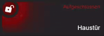
Status-Text (oben rechts – „Abgeschlossen“)
.primary {
  {% if is_state('lock.aqara_smart_lock_u200', 'locked') %}
    color: rgb(0, 161, 136) !important;    # ← TÜRKIS wenn abgeschlossen
  {% elif is_state('lock.aqara_smart_lock_u200', 'unlocked') %}
    color: rgb(176, 16, 16) !important;    # ← ROT wenn aufgeschlossen
  {% else %}
    color: rgb(255, 165, 0) !important;    # ← ORANGE bei Aktion
  {% endif %}
Name (unten rechts – „Haustür“)
.secondary {
  color: white !important;  # ← Farbe des Namens (hier weiß)
Icon-Größe und Position
Icon-Größe
Im Bereich .: | ganz unten:
mushroom-shape-icon {
  --icon-size: 40px;  # ← Icon-Größe (größer = größeres Icon)
Empfohlene Werte:
- Klein: 30px
- Standard: 40px
- Groß: 50px
- Sehr groß: 60px
Icon-Position
mushroom-shape-icon {
  margin: -45px -10px -11px -9px !important;
  # Format: margin: OBEN RECHTS UNTEN LINKS
  # Negative Werte verschieben nach oben/links
  # Positive Werte verschieben nach unten/rechts
Beispiel-Anpassungen:
Icon nach links verschieben:
margin: -45px -10px -11px -20px !important; # ← -20px statt -9px
Icon nach oben verschieben:
margin: -55px -10px -11px -9px !important; # ← -55px statt -45px
Icon nach rechts verschieben (mehr Abstand zum Text):
padding-right: 100px; # ← 100px statt 80px
Text-Größe und Position
Status-Text (Primary = „Abgeschlossen“)
Größe im Bereich .container:
.container {
  --card-primary-font-size: 18px;     # ← Größe Status-Text
  --card-primary-font-weight: 300;    # ← Dicke (100-900, 400=normal, 700=bold)
Position im Bereich .primary:
.primary {
  font-size: var(--card-secondary-font-size) !important;
  position: absolute;
  top: 5px;      # ← Abstand von oben (größer = weiter unten)
  right: 10px;   # ← Abstand von rechts (größer = weiter links)
Name (Secondary = „Haustür“)
Größe im Bereich .container:
.container {
  --card-secondary-font-size: 15px;    # ← Größe Name
  --card-secondary-font-weight: 500;   # ← Dicke
Position im Bereich .secondary:
.secondary {
  font-size: var(--card-primary-font-size) !important;
  position: absolute;
  bottom: 5px;   # ← Abstand von unten (größer = weiter oben)
  right: 10px;   # ← Abstand von rechts (größer = weiter links)
Karten-Höhe
Ganz unten im Bereich ha-card:
ha-card {
  min-height: 90px !important;  # ← Minimale Höhe
  max-height: 90px !important;  # ← Maximale Höhe
  height: 90px !important;      # ← Feste Höhe
  margin-bottom: 12px;          # ← Abstand zur nächsten Karte
Alle drei Werte sollten gleich sein für feste Höhe.
Höhere Karte (z.B. 110px):
min-height: 110px !important;
max-height: 110px !important;
height: 110px !important;
Text-Ausrichtung ändern
Text nach links statt rechts
Im Bereich .primary und .secondary änderst du:
.primary {
  text-align: left;    # ← statt right
  left: 10px;          # ← statt right: 10px
  # right: 10px entfernen!
.secondary {
  text-align: left;    # ← statt right
  left: 10px;          # ← statt right: 10px
  # right: 10px entfernen!