Weiter unten findet Ihr die genauen Erklärungen wie Ihr was anpasst.
sidebar:
width:
mobile: 0
tablet: 25
desktop: 18
title: null
date: true
digitalClock: true
digitalClockWithSeconds: true
dateFormat: dddd DD.MM.YYYY
sidebarMenu:
- action: navigate
navigation_path: /dashboard-haus/haus
name: Start
active: true
icon: mdi:home
- action: navigate
navigation_path: /dashboard-haus/radio
name: Radio
active: true
icon: mdi:radio
- action: navigate
navigation_path: /dashboard-haus/licht
name: Licht
active: true
icon: mdi:lightbulb-multiple
- action: navigate
navigation_path: /dashboard-haus/kamera
name: Kamera
active: true
icon: mdi:cctv
- action: navigate
navigation_path: /dashboard-haus/fenster-turen
name: Fenster + Türen
active: true
icon: mdi:door-closed
- action: navigate
navigation_path: /dashboard-haus/batterie
name: Batterie
active: true
icon: mdi:battery-high
bottomCard:
type: custom:vertical-stack-in-card
card_mod:
style: |
ha-card {
border: none; /* Entfernt den Rahmen der Karte */
box-shadow: none;
border-radius: 0px;
background: transparent;
--stack-card-gap: 12px;
width: 100% !important;
max-width: none !important;
}
cardOptions:
cards:
- type: custom:mushroom-entity-card
entity: lock.aqara_smart_lock_u200
fill_container: true
primary_info: state
secondary_info: name
layout: horizontal
double_tap_action:
action: none
hold_action:
action: none
tap_action:
action: toggle
name: Haustür
icon_color: white
card_mod:
style:
mushroom-shape-icon$: |
.shape {
{# ========== USER CONFIG ========== #}
{% set state_entity = 'lock.aqara_smart_lock_u200' %}
{# ========== END USER CONFIG ====== #}
{% if is_state(state_entity, 'locked') %}
{# ABGESCHLOSSEN = TÜRKIS #}
--shape-color: rgb(0, 161, 136) !important;
--icon-color: white !important;
--shape-animation: none;
opacity: 1;
--glow-1: 0 0 25px 8px rgba(0, 161, 136, 1);
--glow-2: 0 0 55px 18px rgba(0, 161, 136, 0.7);
--glow-3: 0 0 95px 35px rgba(0, 161, 136, 0.45);
{% elif is_state(state_entity, 'unlocked') %}
{# AUFGESCHLOSSEN = DUNKELROT #660000 + ANIMATION #}
--shape-color: rgb(102, 0, 0) !important;
--icon-color: white !important;
--shape-animation: lock-open 1.6s ease-in-out infinite;
opacity: 1;
--glow-1: 0 0 25px 8px rgba(102, 0, 0, 1);
--glow-2: 0 0 55px 18px rgba(102, 0, 0, 0.7);
--glow-3: 0 0 95px 35px rgba(102, 0, 0, 0.45);
--glow-anim: lock-ultraglow 2.2s ease-in-out infinite;
{% elif is_state(state_entity, 'unlocking') or is_state(state_entity, 'locking') %}
{# AKTION = ORANGE #}
--shape-color: rgb(255, 165, 0) !important;
--icon-color: white !important;
--shape-animation: lock-action 0.7s ease-in-out infinite;
opacity: 1;
--glow-1: 0 0 25px 8px rgba(255, 165, 0, 1);
--glow-2: 0 0 55px 18px rgba(255, 165, 0, 0.7);
--glow-3: 0 0 95px 35px rgba(255, 165, 0, 0.45);
--glow-anim: lock-ultraglow 2.2s ease-in-out infinite;
{% else %}
--shape-animation: none;
--glow-1: none;
--glow-2: none;
--glow-3: none;
--glow-anim: none;
opacity: 0.6;
{% endif %}
transform-origin: 50% 50%;
position: relative;
}
/* Glow layers */
.shape::before,
.shape::after {
content: '';
position: absolute;
inset: -8px;
border-radius: inherit;
pointer-events: none;
}
.shape::before {
box-shadow: var(--glow-1), var(--glow-2), var(--glow-3);
animation: var(--glow-anim);
}
.shape::after {
inset: -18px;
box-shadow: var(--glow-1);
opacity: 0.9;
animation: var(--glow-anim);
}
@keyframes lock-ultraglow {
0% {
opacity: 0.9;
filter: brightness(1);
}
50% {
opacity: 1;
filter: brightness(1.4);
}
100% {
opacity: 0.9;
filter: brightness(1);
}
}
@keyframes lock-action {
0% { transform: rotate(-25deg) scale(0.96); }
50% { transform: rotate(25deg) scale(1.04); }
100% { transform: rotate(-25deg) scale(0.96); }
}
@keyframes lock-open {
0% { transform: rotate(10deg); }
50% { transform: rotate(18deg); }
100% { transform: rotate(10deg); }
}
mushroom-state-info$: |
.container {
--card-primary-font-size: 18px;
--card-primary-font-weight: 300;
--card-secondary-font-size: 15px;
--card-secondary-font-weight: 500;
margin-top: -45px;
margin-left: 5px;
text-align: right;
}
.secondary {
font-size: var(--card-primary-font-size) !important;
font-weight: var(--card-primary-font-weight) !important;
color: white !important;
position: absolute;
bottom: 5px;
right: 10px;
}
.primary {
font-size: var(--card-secondary-font-size) !important;
font-weight: var(--card-secondary-font-weight) !important;
{% if is_state('lock.aqara_smart_lock_u200', 'locked') %}
color: rgb(0, 161, 136) !important;
{% elif is_state('lock.aqara_smart_lock_u200', 'unlocked') %}
color: rgb(176, 16, 16) !important;
{% else %}
color: rgb(255, 165, 0) !important;
{% endif %}
text-align: right;
position: absolute;
top: 5px;
right: 10px;
}
.: |
mushroom-shape-icon {
--icon-size: 40px;
display: flex;
margin: -45px -10px -11px -9px !important;
padding-right: 80px;
}
ha-card {
clip-path: inset(0 0 0 0 round var(--ha-card-border-radius, 12px));
border: none;
margin-bottom: 12px;
min-height: 90px !important;
max-height: 90px !important;
height: 90px !important;
padding: 10px 0 !important;
}
- type: custom:mushroom-entity-card
entity: lock.haustur_offner
fill_container: true
primary_info: name
secondary_info: none
layout: horizontal
double_tap_action:
action: none
hold_action:
action: none
tap_action:
action: toggle
name: Tür öffnen
icon_color: white
card_mod:
style:
mushroom-shape-icon$: |
.shape {
{# ========== USER CONFIG ========== #}
{% set state_entity = 'lock.haustur_offner' %}
{# ========== END USER CONFIG ====== #}
{% if is_state(state_entity, 'locked') %}
{# ABGESCHLOSSEN = TÜRKIS #}
--shape-color: rgb(0, 161, 136) !important;
--icon-color: white !important;
--shape-animation: none;
opacity: 1;
--glow-1: 0 0 25px 8px rgba(0, 161, 136, 1);
--glow-2: 0 0 55px 18px rgba(0, 161, 136, 0.7);
--glow-3: 0 0 95px 35px rgba(0, 161, 136, 0.45);
{% elif is_state(state_entity, 'unlocked') %}
{# AUFGESCHLOSSEN = DUNKELROT #660000 + ANIMATION #}
--shape-color: rgb(102, 0, 0) !important;
--icon-color: white !important;
--shape-animation: lock-open 1.6s ease-in-out infinite;
opacity: 1;
--glow-1: 0 0 25px 8px rgba(102, 0, 0, 1);
--glow-2: 0 0 55px 18px rgba(102, 0, 0, 0.7);
--glow-3: 0 0 95px 35px rgba(102, 0, 0, 0.45);
--glow-anim: lock-ultraglow 2.2s ease-in-out infinite;
{% elif is_state(state_entity, 'unlocking') or is_state(state_entity, 'locking') %}
{# AKTION = ORANGE #}
--shape-color: rgb(255, 165, 0) !important;
--icon-color: white !important;
--shape-animation: lock-action 0.7s ease-in-out infinite;
opacity: 1;
--glow-1: 0 0 25px 8px rgba(255, 165, 0, 1);
--glow-2: 0 0 55px 18px rgba(255, 165, 0, 0.7);
--glow-3: 0 0 95px 35px rgba(255, 165, 0, 0.45);
--glow-anim: lock-ultraglow 2.2s ease-in-out infinite;
{% else %}
--shape-animation: none;
--glow-1: none;
--glow-2: none;
--glow-3: none;
--glow-anim: none;
opacity: 0.6;
{% endif %}
transform-origin: 50% 50%;
position: relative;
}
/* Glow layers */
.shape::before,
.shape::after {
content: '';
position: absolute;
inset: -8px;
border-radius: inherit;
pointer-events: none;
}
.shape::before {
box-shadow: var(--glow-1), var(--glow-2), var(--glow-3);
animation: var(--glow-anim);
}
.shape::after {
inset: -18px;
box-shadow: var(--glow-1);
opacity: 0.9;
animation: var(--glow-anim);
}
@keyframes lock-ultraglow {
0% {
opacity: 0.9;
filter: brightness(1);
}
50% {
opacity: 1;
filter: brightness(1.4);
}
100% {
opacity: 0.9;
filter: brightness(1);
}
}
@keyframes lock-action {
0% { transform: rotate(-25deg) scale(0.96); }
50% { transform: rotate(25deg) scale(1.04); }
100% { transform: rotate(-25deg) scale(0.96); }
}
@keyframes lock-open {
0% { transform: rotate(10deg); }
50% { transform: rotate(18deg); }
100% { transform: rotate(10deg); }
}
mushroom-state-info$: |
.container {
--card-primary-font-size: 18px;
--card-primary-font-weight: 300;
--card-secondary-font-size: 15px;
--card-secondary-font-weight: 500;
margin-top: 50px;
margin-left: 5px;
text-align: right;
}
.primary {
font-size: var(--card-primary-font-size) !important;
font-weight: var(--card-primary-font-weight) !important;
color: white !important;
bottom: 5px;
right: 10px;
}
.secondary {
font-size: var(--card-secondary-font-size) !important;
font-weight: var(--card-secondary-font-weight) !important;
{% if is_state('lock.haustur_offner', 'locked') %}
color: rgb(0, 161, 136) !important;
{% elif is_state('lock.haustur_offner', 'unlocked') %}
color: rgb(102, 0, 0) !important;
{% else %}
color: rgb(255, 165, 0) !important;
{% endif %}
top: 5px;
right: 10px;
}
.: |
mushroom-shape-icon {
--icon-size: 40px;
display: flex;
margin: -45px -10px -11px -9px !important;
padding-right: 80px;
}
ha-card {
clip-path: inset(0 0 0 0 round var(--ha-card-border-radius, 12px));
border: none;
margin-bottom: 12px;
min-height: 90px !important;
max-height: 90px !important;
height: 90px !important;
padding: 10px 0 !important;
}
- type: custom:clock-weather-card
entity: weather.weather_at_8215
forecast_rows: 2
hide_clock: true
hide_date: true
hide_forecast_section: true
card_mod:
style: |
ha-card {
border: none;
box-shadow: none;
border-radius: 0px;
background: transparent;
}
- type: custom:button-card
entity: input_boolean.fullscreen
show_state: false
show_icon: true
show_name: false
icon: mdi:arrow-expand
layout: icon_name
size: 15%
card_mod:
style: |
ha-card {
border: none;
box-shadow: none;
border-radius: 0px;
background: transparent;
}
cardStyle: |
:host {
width: 100%;
}
ha-card {
border: none; /* Entfernt den Rahmen der Karte */
background: transparent;
}
style: |
:host
{
--sidebar-background: #242424;
--sidebar-text-color: #fff;
--face-color: #FFF;
--face-border-color: #FFF;
--clock-hands-color: #000;
--clock-seconds-hand-color: #FF4B3E;
--clock-middle-background: #FFF;
--clock-middle-border: #000;
--state-input_boolean-on-color: #00A188;
--state-input_boolean-active-color: #00A188;
--state-active-color: #00A188;
--sidebar-selected-text-color: white;
}
.date {
margin-bottom: 0px;
color: #00A188;
opacity: 1;
font-size: 25px;
font-weight: 300;
text-align: center;
letter-spacing: -0.05vw;
}
h1.digitalClock.with-seconds {
margin-top: 0px;
margin-bottom: 5px;
font-size: 60px;
text-align: center;
line-height: 40px;
font-weight: 400;
color: white;
cursor: default;
}
.sidebarMenu {
font-size: 25px;
line-height: 24px;
font-weight: 400;
}
.sidebarMenu li.active::before {
background-color: #00A188!important;
}
.sidebarMenu li.active ha-icon {
color: white!important;;
}
:host ::slotted(.card-content) {
padding: var(--ha-space-4);
margin-bottom: 50px
}
}
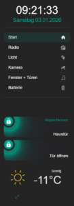
Sidebar Anpassungs-Guide
Alle Einstellungen erklärt
Grundeinstellungen
Breite der Sidebar
Ganz oben findest du die Breiteneinstellungen:
sidebar:
  width:
    mobile: 0      # ← Mobile (0 = ausgeblendet)
    tablet: 25     # ← Tablet (25% der Bildschirmbreite)
    desktop: 18    # ← Desktop (18% der Bildschirmbreite)
Werte in Prozent (%):
0= Sidebar versteckt15-20= Schmal (gut für Desktop)25-30= Mittel (gut für Tablets)35-40= Breit (viel Platz)
Titel und Datum
  title: null              # ← Sidebar-Titel (null = kein Titel)
  date: true               # ← Datum anzeigen (true/false)
  digitalClock: true       # ← Digitale Uhr anzeigen
  digitalClockWithSeconds: true  # ← Mit Sekunden
  dateFormat: dddd DD.MM.YYYY    # ← Format: "Montag 04.01.2025"
Titel hinzufügen:
title: "Mein Smart Home" # ← Statt null
Datumsformat ändern:
DD.MM.YYYY= 04.01.2025DD/MM/YYYY= 04/01/2025YYYY-MM-DD= 2025-01-04dddd DD.MM.YYYY= Montag 04.01.2025 (mit Wochentag)
Menü-Einträge anpassen
Im Bereich sidebarMenu: findest du alle Menüpunkte:
  sidebarMenu:
    - action: navigate
      navigation_path: /dashboard-haus/haus
      name: Start              # ← Name im Menü
      active: true             # ← true = anklickbar, false = deaktiviert
      icon: mdi:home           # ← Icon (Material Design Icons)
Neuen Menüpunkt hinzufügen
Kopiere einen Block und ändere ihn:
    - action: navigate
      navigation_path: /dashboard-haus/DEINE-SEITE
      name: Dein Name
      active: true
      icon: mdi:DEIN-ICON
Icons ändern
Suche Icons auf: https://materialdesignicons.com/
Beispiele:
mdi:home= Hausmdi:lightbulb= Glühbirnemdi:thermometer= Thermometermdi:weather-cloudy= Wettermdi:chart-line= Diagramm
Menüpunkt entfernen
Lösche den kompletten Block (von - action: bis vor dem nächsten -).
Farben anpassen
Im Bereich style: | ganz unten findest du alle Farb-Definitionen:
Hintergrundfarbe der Sidebar
--sidebar-background: #242424; # ← Dunkelgrau (Hex-Code)
Farben ändern:
#000000= Schwarz#FFFFFF= Weiß#242424= Dunkelgrau (aktuell)#1a1a1a= Noch dunkler#2C3E50= Blaugrau#34495E= Grau-Blau
Textfarbe
--sidebar-text-color: #fff; # ← Weiß (#fff = Kurzform für #FFFFFF)
Akzent-Farbe (Türkis)
Die Akzentfarbe siehst du beim Datum und aktiven Menüpunkten:
--state-active-color: #00A188; # ← Türkis (Akzentfarbe)
Alle Stellen mit Akzentfarbe:
--state-input_boolean-on-color: #00A188;
--state-input_boolean-active-color: #00A188;
--state-active-color: #00A188;
Andere Farben ausprobieren:
#FF4B3E= Rot#3498DB= Blau#2ECC71= Grün#9B59B6= Lila#F39C12= Orange
Ändere alle drei Zeilen auf die gleiche Farbe!
Datums-Farbe
.date {
  color: #00A188;  # ← Farbe des Datums
Uhrzeit-Farbe
h1.digitalClock.with-seconds {
  color: white;  # ← Farbe der Uhrzeit
Aktiver Menüpunkt
.sidebarMenu li.active::before {
  background-color: #00A188!important;  # ← Balken links vom aktiven Punkt
}

.sidebarMenu li.active ha-icon {
  color: white!important;  # ← Icon-Farbe wenn aktiv
}
Schriftgrößen ändern
Datum
.date {
  font-size: 25px;      # ← Größe des Datums
  font-weight: 300;     # ← Dicke (100-900, 300=dünn)
Uhrzeit
h1.digitalClock.with-seconds {
  font-size: 60px;      # ← Größe der Uhrzeit
  font-weight: 400;     # ← Dicke
  line-height: 40px;    # ← Zeilenabstand
Menü-Text
.sidebarMenu {
  font-size: 25px;      # ← Größe der Menüpunkte
  line-height: 24px;    # ← Zeilenabstand
  font-weight: 400;     # ← Dicke
Empfohlene Werte:
Kleiner:
.sidebarMenu {
  font-size: 20px;
  line-height: 20px;
Größer:
.sidebarMenu {
  font-size: 30px;
  line-height: 28px;
Abstände anpassen
Abstand Datum zu Uhr
.date {
  margin-bottom: 0px;  # ← Abstand unten (größer = mehr Abstand zur Uhr)
Abstand Uhr zu Menü
h1.digitalClock.with-seconds {
  margin-top: 0px;      # ← Abstand oben
  margin-bottom: 5px;   # ← Abstand unten (zu Menü)
Abstand am Ende der Sidebar
:host ::slotted(.card-content) {
  padding: var(--ha-space-4);
  margin-bottom: 50px  # ← Abstand unten bei Bottom-Cards
Uhr-Design anpassen
Falls du eine analoge Uhr nutzen würdest (aktuell digital):
--face-color: #FFF;                    # ← Zifferblatt-Farbe
--face-border-color: #FFF;             # ← Rahmen-Farbe
--clock-hands-color: #000;             # ← Zeiger-Farbe
--clock-seconds-hand-color: #FF4B3E;   # ← Sekundenzeiger (Rot)
--clock-middle-background: #FFF;       # ← Mitte
--clock-middle-border: #000;           # ← Mitte-Rahmen
Text-Ausrichtung
Datum zentrieren/links/rechts
.date {
  text-align: center;  # ← center/left/right
Uhr zentrieren/links/rechts
h1.digitalClock.with-seconds {
  text-align: center;  # ← center/left/right
Bottom Cards (Karten unten)
Die Karten am unteren Ende der Sidebar findest du unter bottomCard:.
Transparenz der Container-Karte
bottomCard:
  card_mod:
    style: |
      ha-card {
        background: transparent;  # ← Transparent
        border: none;             # ← Kein Rahmen
        box-shadow: none;         # ← Kein Schatten
Hintergrund hinzufügen:
background: rgba(255, 255, 255, 0.1); # ← Leicht weiß transparent
Abstand zwischen Bottom Cards
ha-card {
  --stack-card-gap: 12px;  # ← Abstand zwischen den Karten
Mehr Abstand:
--stack-card-gap: 20px;
Weitere Anpassungen
Sidebar nur auf Desktop anzeigen
width:
  mobile: 0     # ← Versteckt auf Handy
  tablet: 0     # ← Versteckt auf Tablet
  desktop: 20   # ← Nur Desktop
Datum ohne Wochentag
dateFormat: DD.MM.YYYY # ← Ohne "Montag"
Uhr ohne Sekunden
digitalClockWithSeconds: false # ← Keine Sekunden
Menü deaktivieren (nur Anzeige)
Bei jedem Menüpunkt:
- action: navigate
  navigation_path: /dashboard-haus/haus
  name: Start
  active: false  # ← false = ausgegraut, nicht klickbar
  icon: mdi:home